
Pink is the new black
Jenny Lord has spent years exploring the ocean as a technical diver and underwater photographer. Her passion is the deep, but her mission goes a little further: encouraging more women to discover technical diving and feel at home in a world that has traditionally been seen as male-dominated.
“Pink is the new black” became the idea behind her brand — a playful way of challenging expectations without taking the diving itself any less seriously.
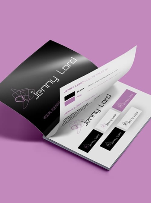
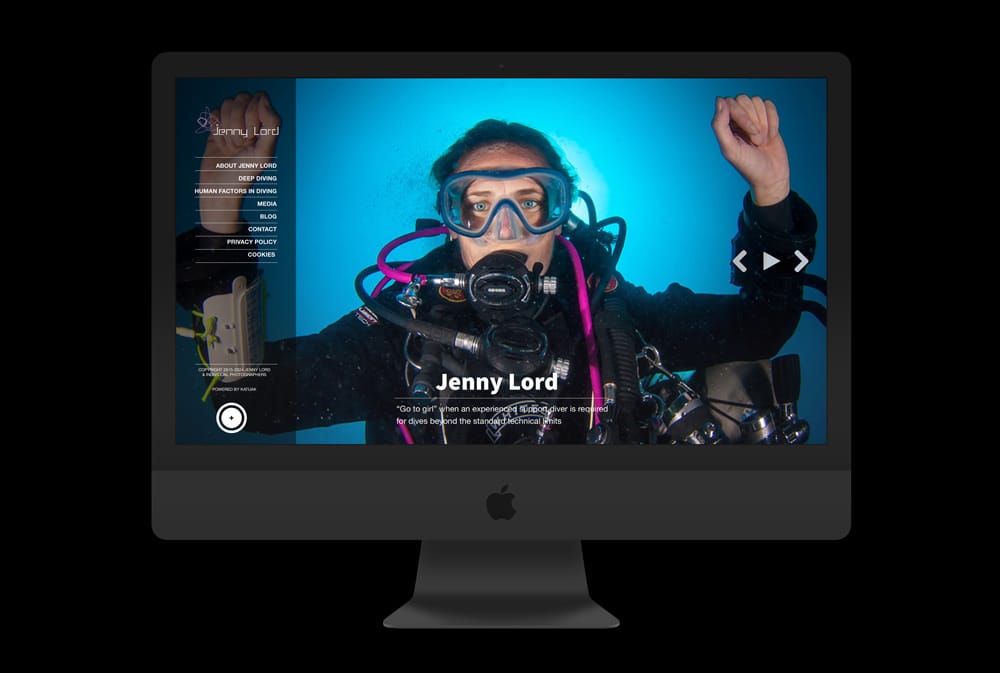
I created the visual identity and carried it across the website, print materials and photography. The identity is deliberately simple: black, white and a soft pink, with a strong typographic approach that lets Jenny's personality and photography take centre stage.
#000000
#c289bc
#ffffff
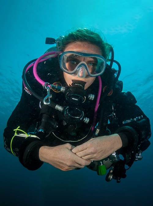
Jenny is a fantastic underwater photographer, so there was no shortage of beautiful diving imagery for the project.
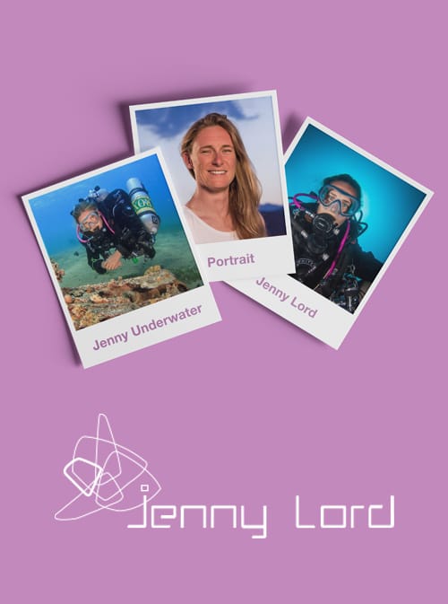
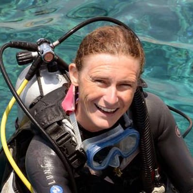
What was missing were photographs of Jenny herself — not behind the camera, but as a woman, diver and the person behind the brand.
Katuaks in-house photographer Kjeld Friis captured a series of portraits that brought that side of Jenny into the website, giving the brand a more personal face above the water.


Creating my brand is a challenging task. As a photographer, I am used to being behind the lens and not having to worry about how I present myself or what I am known for. Elvira helped me craft something that truly reflects who I am. The pink colour, the logo, the website, the photos... everything looks and feels amazing!
- Jenny Lord