Shiny, happy diving
Liquid Adventures Dahab is a PADI 5-Star IDC Dive Resort with a simple philosophy: be professional, be friendly, and make diving as easy and enjoyable as possible. Their divers value authenticity. They don't want a pretentious dive centre, but they do appreciate a place with its own personality and a memorable experience.
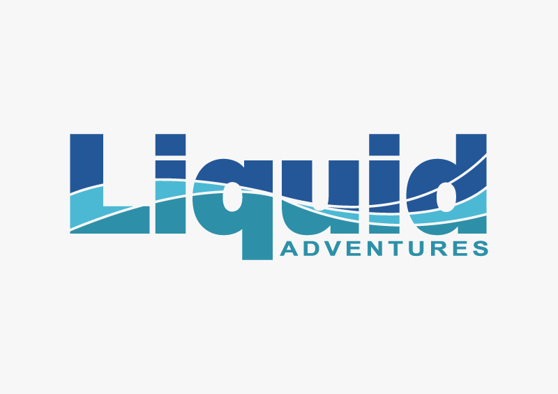
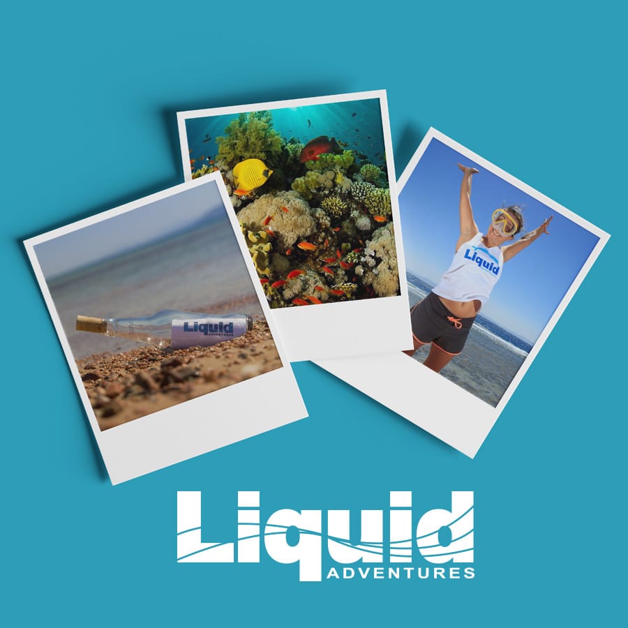
That became the starting point for the new identity. I combined solid nautical colours with friendly typography, playful graphic elements and plenty of optimism, creating a visual language that felt professional without taking itself too seriously.
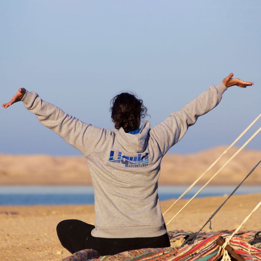
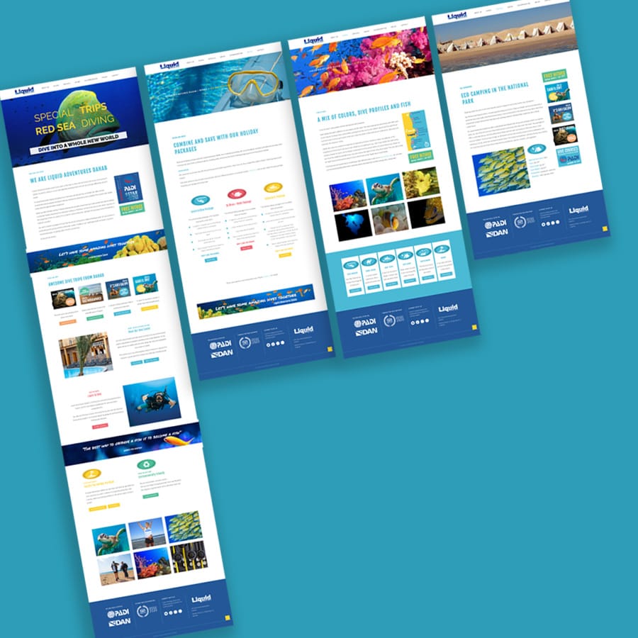
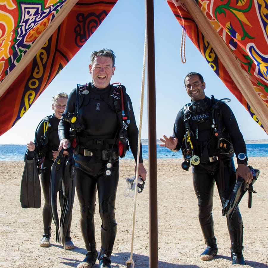
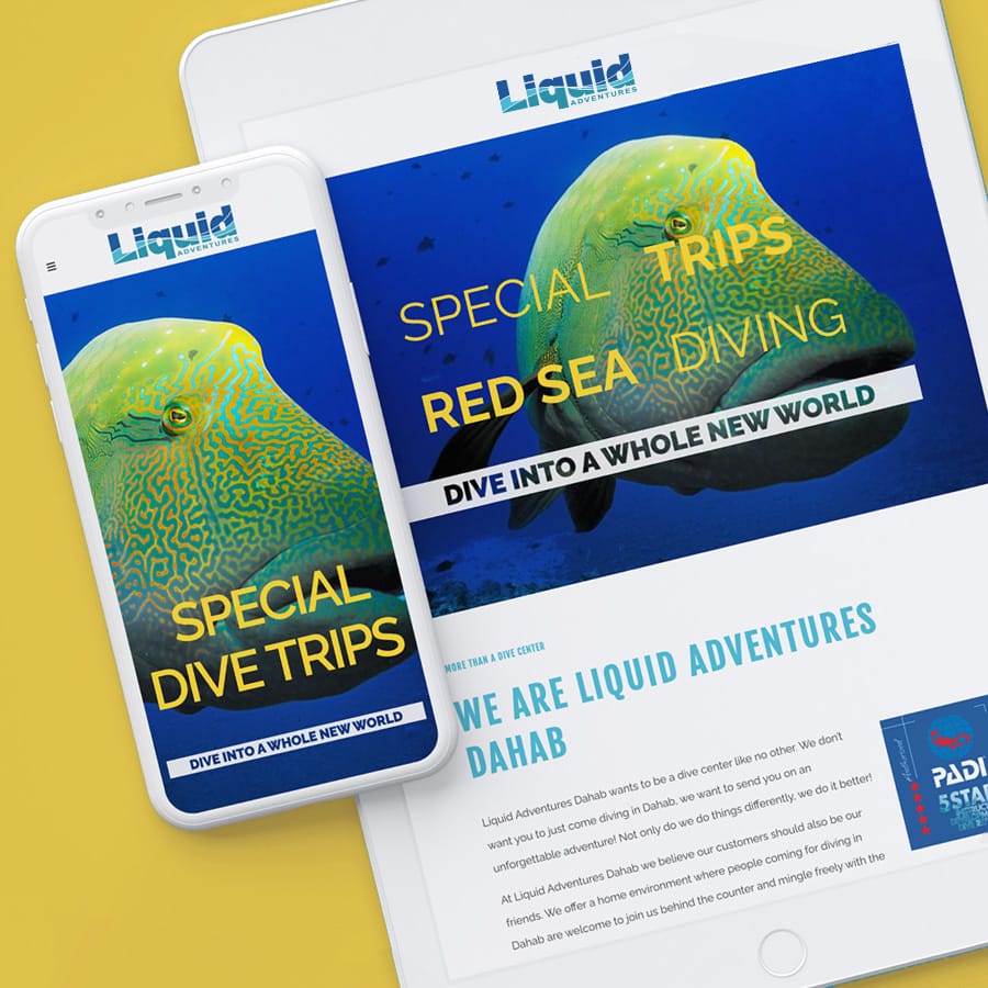
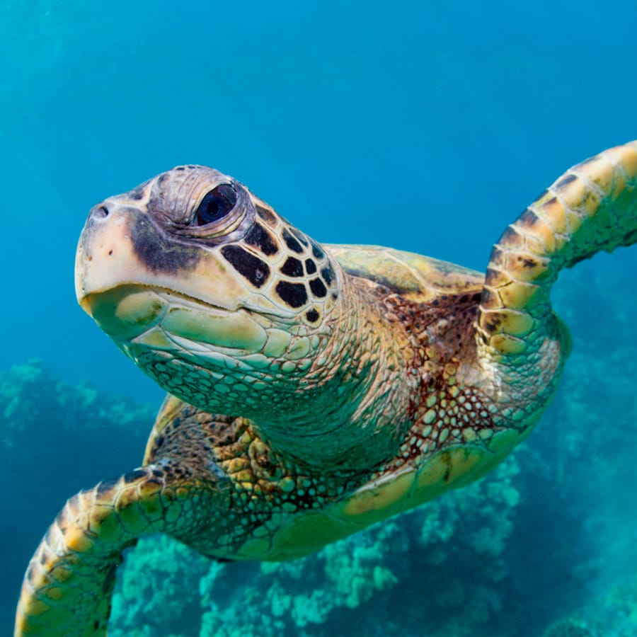
I designed and developed the website, created the photography, and extended the identity into T-shirts, campaigns and a social media content system.
#245798
#4bbad5
#2f90a8
Professional, but never too serious
The identity was built around a straightforward idea: Liquid Adventures should feel experienced and trustworthy, but also like somewhere you'd actually enjoy spending your holiday.
A strong blue palette gives the brand its nautical foundation, while playful illustrations and graphic elements add energy and personality. The result is a flexible identity that can move easily between the website, print, merchandise and social media.
Professional, but never too serious
The identity was built around a straightforward idea: Liquid Adventures should feel experienced and trustworthy, but also like somewhere you'd actually enjoy spending your holiday.
A strong blue palette gives the brand its nautical foundation, while playful illustrations and graphic elements add energy and personality. The result is a flexible identity that can move easily between the website, print, merchandise and social media.
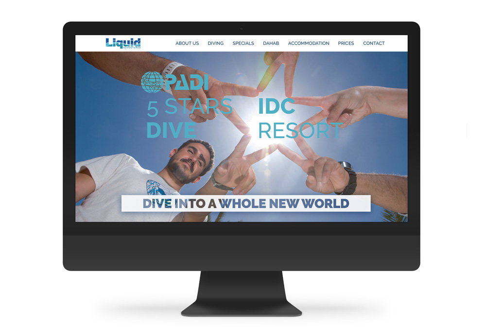
I really love the website! It truly reflects who we are. The design is easy, happy and stylish, which we love. The colours, the graphics and the beautiful photos fits perfectly with the look we wanted. Shukran Jazeelan!
- Bassem Nsr Tamem, Liquid Adventures Owner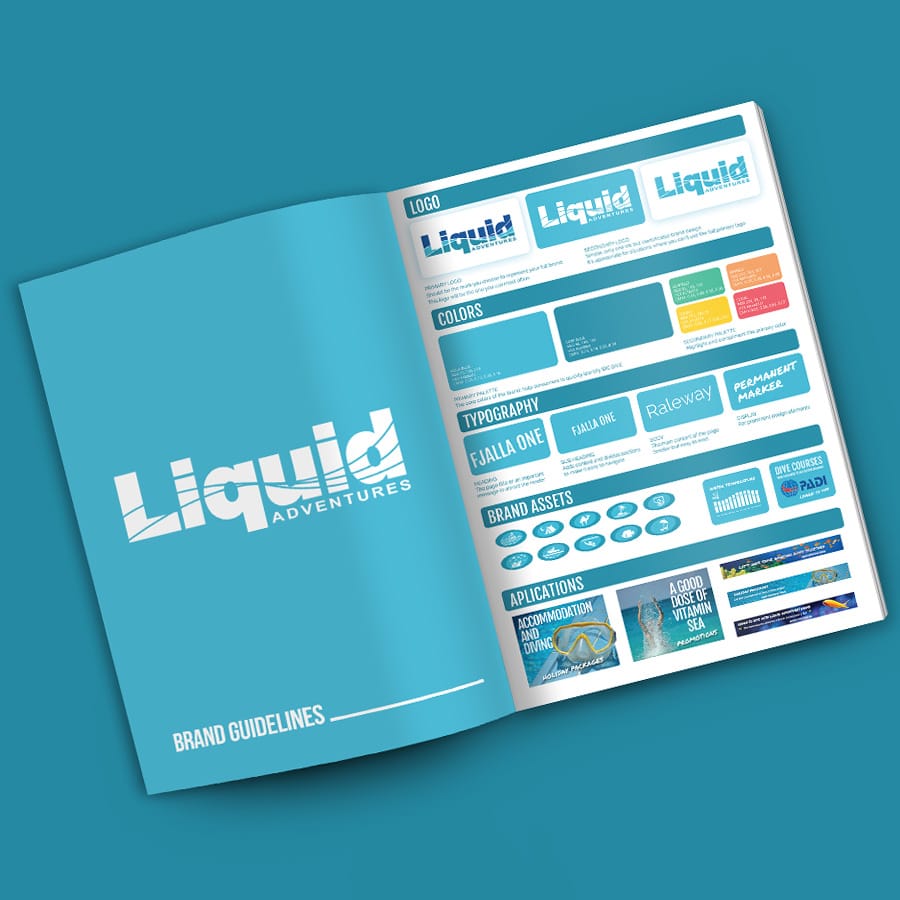

Extra safety. No extra cost.
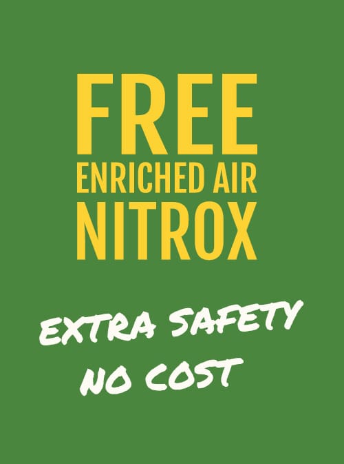
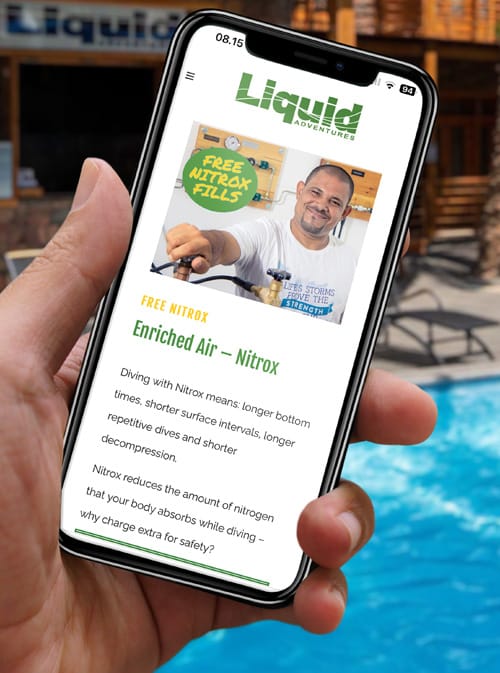
Bassem wanted all Liquid Adventures divers to have access to Nitrox without paying extra for the refill. He also offered discounted PADI Nitrox Specialty courses as part of his approach to making diving safer and more accessible.
That idea deserved a campaign of its own.
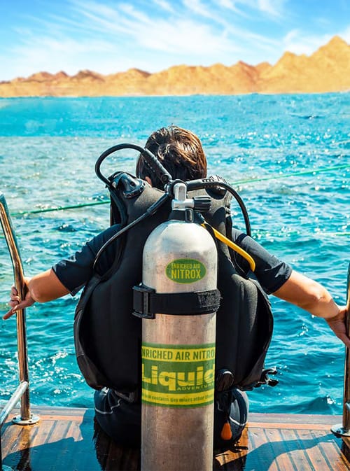
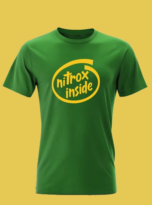
Nitrox tanks are traditionally marked with bright yellow and green decals, so I used those colours as the starting point and built a playful visual system around them.
The campaign included T-shirts, tank decals, digital banners and promotional graphics, turning a practical diving message into something colourful and easy to recognise.
Nitrox tanks are traditionally marked with bright yellow and green decals, so I used those colours as the starting point and built a playful visual system around them.
The campaign included T-shirts, tank decals, digital banners and promotional graphics, turning a practical diving message into something colourful and easy to recognise.
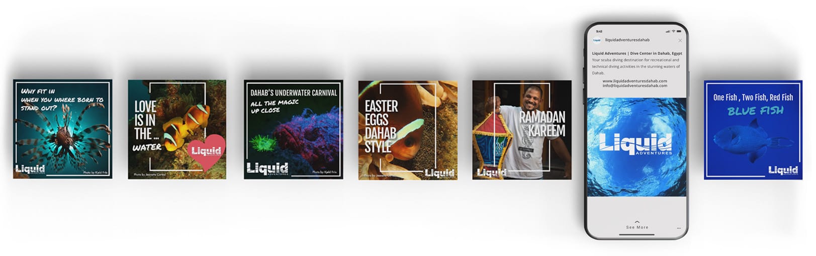
To make social media easier to manage, I created a content calendar covering the dates and moments that could matter to Liquid Adventures throughout the year.
Alongside important Egyptian holidays and seasonal greetings, the calendar included diving and marine conservation awareness days such as World Oceans Day and Shark Awareness Day.
And then there was room for a little fun: Western pop culture, humour and other moments that would resonate with the people actually following the brand.
I created ready-to-use templates for Instagram and Facebook, giving the team a library of content they could adapt and publish throughout the year while keeping the visual identity consistent.
With this structured approach, we’re ensuring a steady flow of content that strengthens Liquid Adventures Dahab's brand identity and nurtures a lively online community for divers.